The initial version of the website was heavily reliant on the visual design and on meeting the project criteria. Overall, it achieved my goal of a functional website, but, as usual, there were areas for improvement. The code was heavily reliant on IDs, misuse of semantics, inconsistent alt-text, non-inclusive, and weak SEO. So I started to slowly dissect the website starting off with the feedback from my professor, David Watson.
Revision
For the website, I began the revision by addressing my professor David Watson’s feedback. There were several points that he made that I needed to address.
Hard-coded uppercase
There were several places in my code where I’d written text in uppercase directly in the HTML, mainly on the home page. I switched these out and used text-transform: uppercase in CSS instead — this way the styling stays in the stylesheet where it belongs and is much easier to change in the future.
Markup semantics
David flagged that I wasn’t always using <section> correctly and suggested using <figure> when pairing an image with text. I went through my code and found the main issue on the “What’s in Store” page. The products grid had images and captions sitting inside a <div> with plain <p> tags. I replaced these with <figure> and <figcaption>, which is the proper semantic choice for image caption pairings.
Alt text consistency
Some of my alt text was describing the image visually, and some was explaining its purpose, which wasn’t consistent. I went back through all the images across the site and tried to keep the approach uniform throughout.
Navigation hover state
The hover effect on the navbar was causing nearby elements to shift around, which David flagged as a major distraction. I revised the styles so the hover effect stays contained to the element being hovered over without nudging anything else.
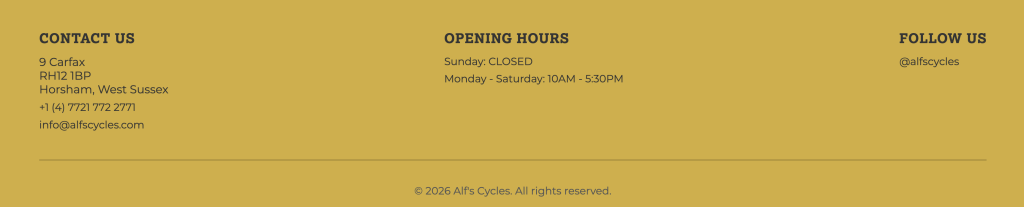
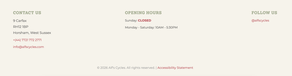
Footer colour
David suggested swapping the mustard yellow footer for the green used elsewhere on the site. I did try it, but I wasn’t convinced by it either. I ended up going with a neutral beige instead, which I think sits better with the overall palette. Below you can see the mustard yellow, which was the initial design. With the new design, I was able to have a stronger play on colors as well.
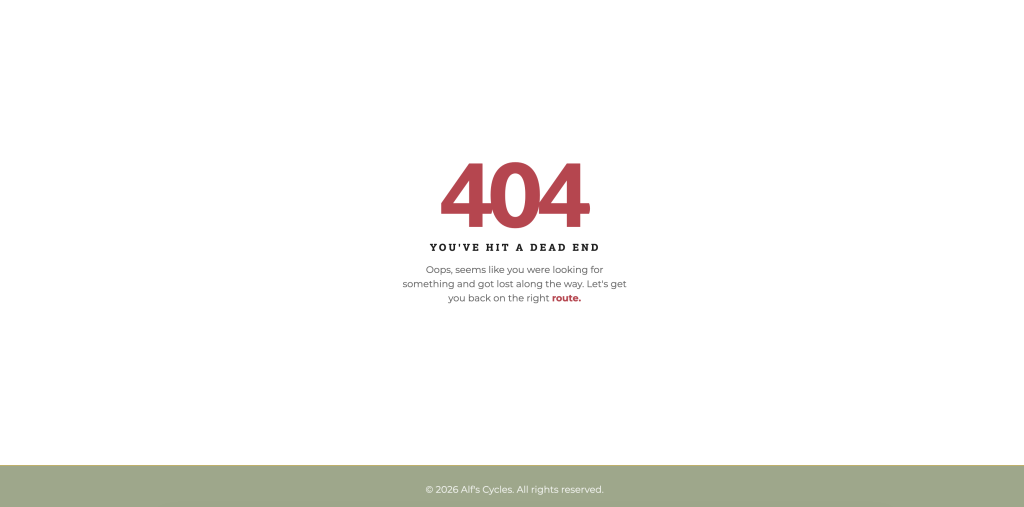
After reviewing David’s feedback, it was time to begin revising the website based on what we learned over the past few months. The first task I started with was the 404 page, which I initially didn’t have.
404 Page
This was done through the .htaccess file. I designed a friendlier page that aligned with the site’s branding. It also returns the user to the main page and enhances their overall experience. Connecting the 404 page to my site was a struggle, but I got there eventually with help from my classmates Sarah & Season.
SEO
Meta descriptions and titles — each page had a unique, descriptive <title> and <meta name=”description”> tag written with relevant keywords for a local bike shop in Horsham.
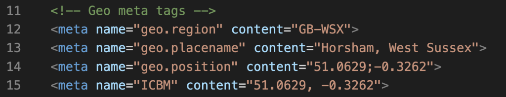
Geo meta tags — I added geolocation SEO tags to every page with Horsham’s coordinates and region (shoutout to Season’s blog for the guidance on this one!).
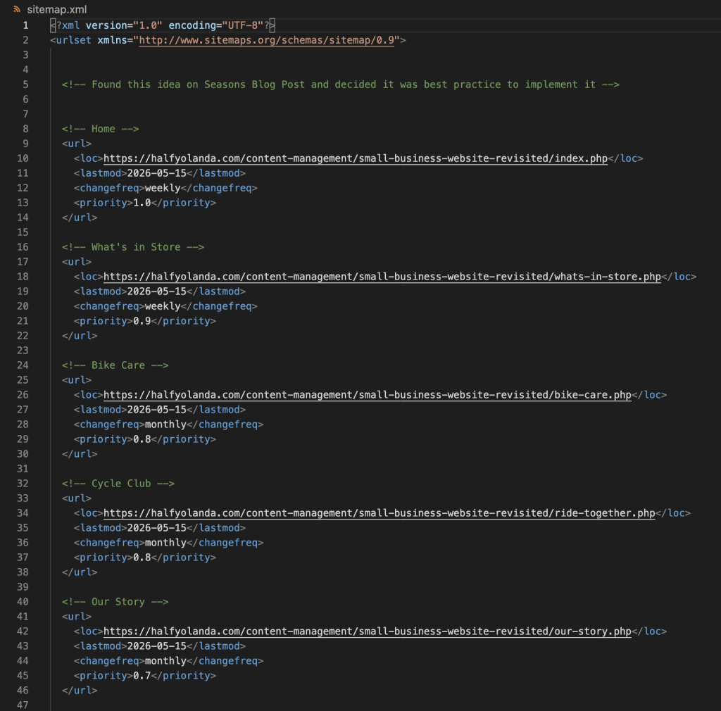
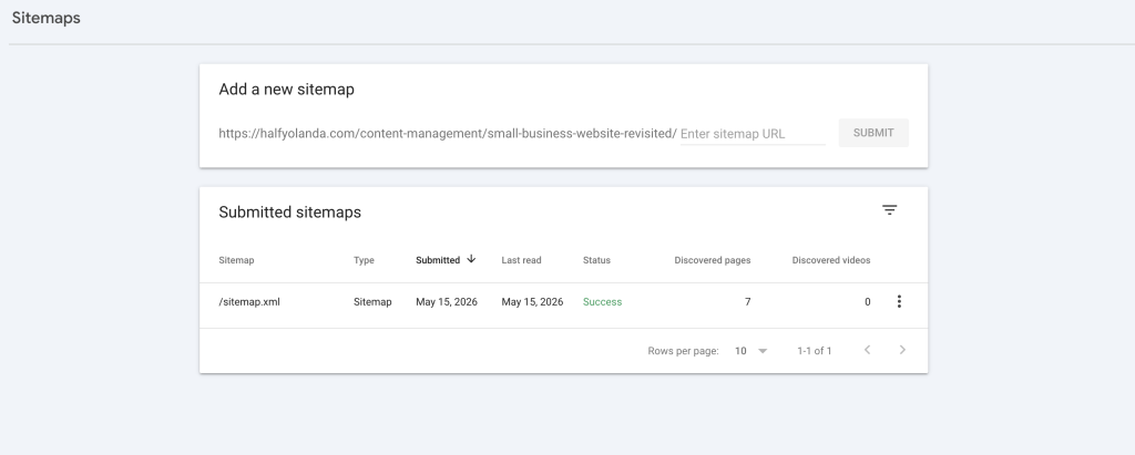
sitemap.xml — created a sitemap listing all your pages with lastmod, changefreq, and priority values. I wasn’t initially planning to add this, but after going through Season’s journal, I decided it was worth doing properly.
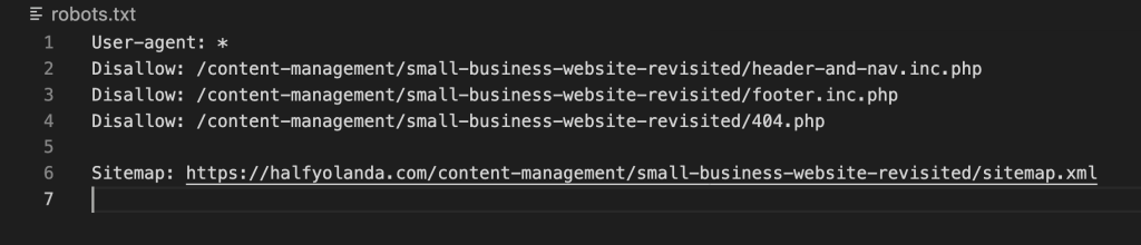
robots.txt — I added a robots file to guide search engine crawlers on what to index, and pointed it to the sitemap.
Google Search Console — I set up Search Console for the site and submitted the sitemap directly so Google can start crawling and indexing the pages.
Accessibility
The next thing I tackled was accessibility. I started by running the site through several tools we’d used in the module, including the WAVE tool and PageSpeed Insights. This gave me a stronger idea of where the website stood before making any changes.
ARIA Labels – the website initially had none, so I needed to add them to the <nav>, <main>, <footer>, and any other links that were on the site.
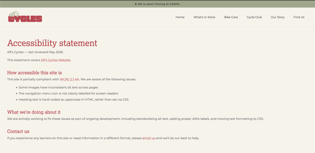
Accessibility Statement – This page was added and can be found in the footer. It outlines the page’s dedication to an inclusive website and guides users to contact us about any issues.
3. Skip link- I added a skip to main content link for keyboard users and screen readers.
4. It was also suggested that I reduce some of my image sizes. However, after reviewing them, I felt that further compression would compromise image quality. Given that they were already well-optimized and my PageInsights score was at 83, it didn’t feel necessary.
5. One suggestion was to improve the contrast of white text on a green background. After reviewing it, I felt the contrast was sufficient and didn’t negatively impact readability, so I chose not to make changes here.
JavaScript
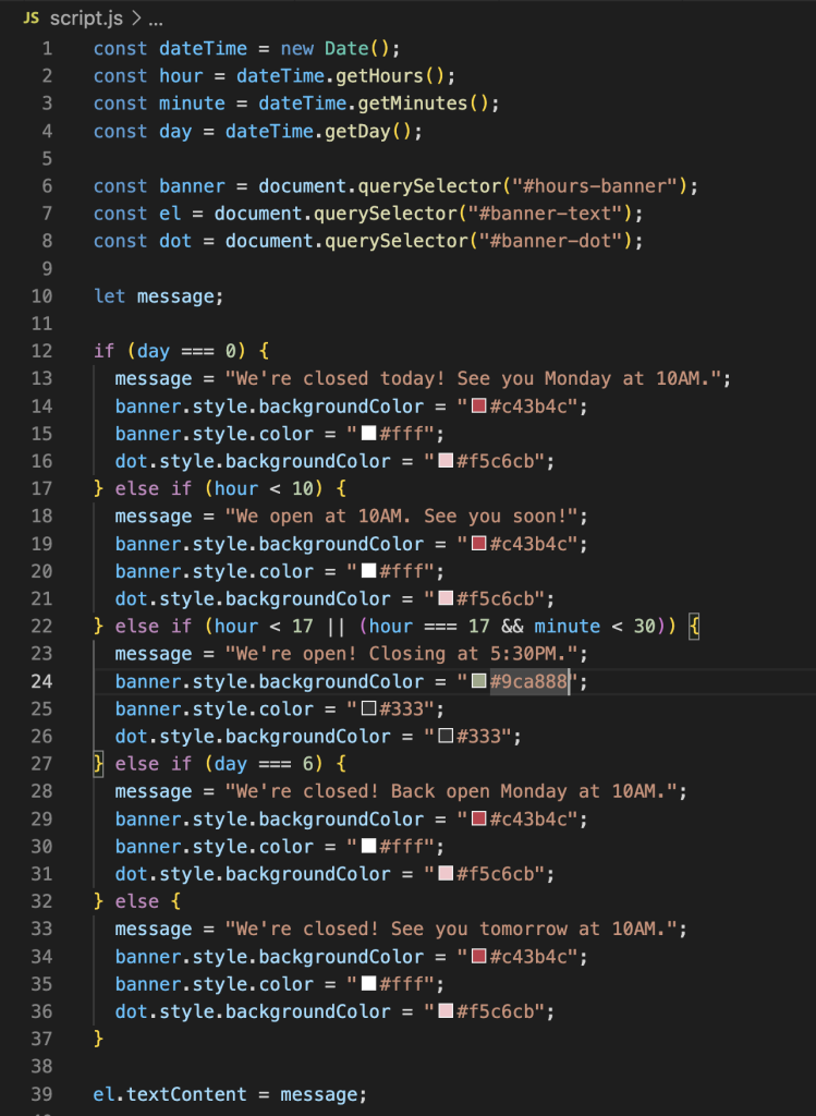
For the JavaScript element, I decided to add a dynamic opening hours banner at the top of the page. Since the site is mobile-first, I felt this was the most practical spot for it. The banner automatically updates based on the current time and day, changing both the text and color to reflect whether the shop is open or closed.
PHP
The last task I tackled was the PHP server-side. For this, I moved the header, navigation bar, and footer into shared include files and converted all my HTML files to PHP. I kept the header and nav together in one file and the footer in another. This made the codebase much easier to manage and maintain, so any future changes to the header or footer only need to be made in one place.
For my major project, I chose to explore the architectural heritage of my home city, Damascus. Specifically, I want to focus on the history behind the traditional homes found in Babtouma, one of Damascus’s oldest inhabited neighbourhoods. Initially, I considered exploring the historical cities and monuments across Syria, but that scope felt too broad. By narrowing my focus to Babtouma, I could create a more meaningful and manageable project. The neighbourhood itself is known for its beautiful courtyards, intricate stonework, and central fountains. Babtouma is also historically significant as an area where mosques, churches, and synagogues have stood side by side for centuries, reflecting Damascus’s rich tradition of cultural and religious coexistence. These are architectural elements that are reflected in each home influenced by the cultural norms of Syrians. Due to all the conflict over the years, a lot of Syria’s history remains neglected, undocumented and inaccessible.
My motivation for this project stems from a desire to preserve and share these beautiful spaces. These centuries-old homes tell stories about culture, family life, and craftsmanship that deserve to be recorded and experienced. By creating a website that focuses on these traditional homes, I can open up a world that people can access at any time and from anywhere. This digital platform will enable cultural preservation, storytelling, and visual exploration for diverse audiences.
Taking a user experience design approach is essential when creating this project. I need to consider the types of users who would use this website and how to guide each of them through it in a meaningful and engaging way. Different users will approach this site differently—whether for academic research, cultural connection, or visual exploration. This article will reflect on the user experience research and design techniques we learned in the UX workshops and how they can be applied to my Major Project website through methods such as user research, empathy mapping, and journey mapping.
During the UX workshop, we learned that with effective design it’s always important to define the problem first. We need to consider the types of users we currently have and whom we could potentially retian. For my major project, this led for the need to identify who could benefit from this type of resource.
Defining the Problem & User Needs
When brainstorming this idea, I encountered several problems. The first was that much of Syria’s historical information is extremely inaccessible and lost. The country carries such a rich history that the world seems largely unaware of. The homes in Babtouma are filled with untold stories and architectural significance that should be shared. Another problem that I encountered would be the language barrier. As an Arabic-speaking country, most of Syria’s historical content and documentation exists only in Arabic. This creates challenges in gathering information and translating it accurately for an English-speaking audience. Architectural terminology, cultural context, and the stories behind these homes can easily be lost in translation. Beyond this was finding the visual documentation of these homes. Many of these homes have never been properly documented or photographed. There is a lack of imagery making it difficult to study or appreciate the architectural details, from the structure desgin to the furniture and even stonework. Furthermore, there is the political instability the country has gone through over the past decade. This has made it difficult to preserve history. Many buildings have been severely damaged, neglected and inaccessible; creating a need for proper documentation.
User Personas
When researching my target audience there were several different personas I was able to come up. Below are the three personas that I created; Lina, Caroline & Khalil.
Although I created three personas, I decieded to proceed with a slightley generic empathy map that could loosely be applied to all three. With empathy mapping we need to consider their shared frustrations and common feelings.
One of the main aspects I need to consider when creating this website would be how I will display the information. There are really several ways one could tackle this. I need to consider how the content is labeled, structured and organized to help the users efficinetly use the site. The three options that I am considering are the following: a timeline, locations or architecural elements.
Timeline
The content would be organized in chronological order. Where the user is able to scroll through a physical timeline and each home will be shown on it. With this, I will be able to show architectural evolution over time.
Each home will be clickable and take the user to another page that is focused solely on the home.
Location
Here the content will be located on a map of Babtouma. It will be an interactive map that allows the user to click on the building which will also take them to another page focused on the home.
Architectural Elements
This would be strongly catered to an architectural user. The user will be able to filter certain elements of a home with key features of: fountain, stonework, screens, arches, domes etc.
This allows the user to explore the history behind each architectural element and learn more about their key points.
When considering these three options, I definitely am leaning more towards the timeline or location methods. I feel like these are strongly catered to my personal goals for this website and how I am imagining it to turn out. Of course, each home will have its own page where it will offer the user more information on the home. Regarding the architectural elements, since each home carries similar features such as a courtyard, fountain, screens, arches, stonework etc. I plan to include this on a separate glossary page that dives deeper into each element with detail.
In regards to the accesibility considerations there are several elements I would need to consider. To ensure that the website is accessible to all users I need to follow WCAG guidelines by including alt text for the images, proper heading, proper colour contrast and proper navigation. Considering that majority of society accesses content on their mobile. I would definitely need to have a strong mobile-approach layout. People are more likely to browse a website through their mobiles, especially when travelling.
Another option I am considering for this website is to make it multilingual. I could approach this by using a language toggle placed in the top right of the page so users don’t miss it. Completing a translation for this website would be very beneficial for users, but it presents several technical challenges for me. Arabic is a right-to-left (RTL) language, which means the entire layout,navigation, and text alignment would need to be reversed when switching to Arabic. This requires careful coding to ensure proper display without breaking the design. Given these complexities, implementing the bilingual functionality could be done in the second phase of the website development. Although, this would be a great integration to the website it will definitely be a challenge.
Content Strategy
When it comes to the individual pages of the homes I find, I want to focus mainly on the historical background and architectural structures. If the home is still being resided in, I would love to include a family story. That would tie very nicely into the historical background aspect and provide a personal, human connection to the architecture.
When it comes to gathering the information, I’m going to have to do a lot of research. One of the most crucial parts of this project will be the accuracy of the information I present. To start off, I’ll search for what I can find online through academic databases and existing resources. The next step would be to explore libraries; both at school and public libraries around London. I’ll search for books, journals, and archival materials on Damascus’s architecture. I can also search bookstores and Amazon to see if I can purchase any specialized books with further information.
After narrowing down which homes I want to highlight, I could then physically travel to Syria to tour and photograph the homes myself. I could get in touch with local families, historians, and people who are knowledgeable about these homes. These firsthand accounts and direct documentation would provide the most authentic and detailed content for the website.
Visual Design
When looking at the visual design of the website, there are different approaches I am considering. There is a heavy lack of high-quality photography when it comes to key locations in Syria. This is driving me to have proper photography taken of these locations and homes. These places deserve to be properly documented with quality work. The photos can be displayed throughout the website, specifically in the individual pages and glossary.
Another approach I’m considering is to illustrate some of the homes. I think this would work really well for the home page. The only concern I have is the time and how I would apply this throughout the website. I am wondering if there is a way to include both photography as well as illustrations for my idea. The illustrations will provide a warmer and welcoming feel to the website. While the photography will strongly highlight the architectural beauty of the homes.
In regards to the color scheme, I’m imagining the website to carry neutral colors of beige and black. I would want to include either dark emerald green or dark midnight blue for highlights. I want the website to have a neutral feel since it’s focused primarily on the architecture and history of the locations, allowing the content and imagery to be the focal point. I’m going for this color scheme because I want it to reflect the feel of these homes. A majority of them are built with beige sandstone and the detailed work is done in black. By using colors inspired directly from the architecture itself, the website design will have an authentic feel to it.
Testing & Feedback Strategy
For testing and feedback, there are several people I want to approach within different stages. During the prototype phase, I want to run the different ideas by my classmates and mentors. Their opinions and feedback would be the most valuable since they are experienced with web design and user experience. With the visual and design phase, I would get feedback from specific mentors, classmates, friends and family. My only concern here would be that design can be very subjective, so I would be very selective about the opinions that I would consider.
For the final stage of the website, I would like to conduct stronger usability testing with people who match the potential personas that I have listed. Ensuring that the website meets their needs is a goal I would hope to achieve. If I were able to find users matching these personas, that would be the ideal strategy for feedback.Additionally, I would also test with family, friends, and classmates across different devices to ensure the site functions properly on various screen sizes, platforms and user functionality.
Conclusion
At first, I was dreading the thought of writing this. When I got into the flow and started doing the personas and empathy mapping, I realized why it’s so important and how helpful it can be. In a way, this allowed me to lay out all my thoughts and organize them. UX matters for this project because it allows me to dive deep into what I’m creating and ensures the website will actually serve the people who could use it.
Moving forward, I will be considering the user personas as well as the empathy map during my planning stage. By completing this, I am one step closer to the development stage; but not there yet. I’ll be able to refer back to my ideas of visual design, content strategy and information architecture. The testing strategy I developed will help me gather feedback at different stages and slowly make improvements as I go. Overall, the user-centered approach ensures that the website serves people who are seeking to learn about, research, or reconnect with Damascus’s architectural heritage.
After completing the UXD approach, I feel more confident about creating something meaningful. This project is deeply personal to me and I want to create something that truly preserves these historic homes and the beauty within them.
Ever found yourself searching through thousands of lines of CSS just to update a font colour you’ve changed your mind about? CSS Custom Properties were made for you. In this post, we’ll go through what they are, how they work, and when to use them.
CSS Custom Properties were first introduced in 2012 and became fully supported across major browsers by 2017. They allow developers to define reusable values directly in their CSS — think of it as a shared bookshelf that your whole stylesheet can access. No build tools or preprocessors needed. Instead of searching through lines of CSS for a colour or spacing value, you define it once and update it in a single place. This keeps your stylesheets cleaner, consistent, and easier to maintain. Custom Properties are particularly useful when it comes to themes, media queries, and dynamic styling with JavaScript.
How do we use CSS Custom Properties
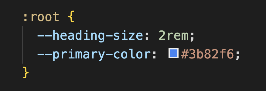
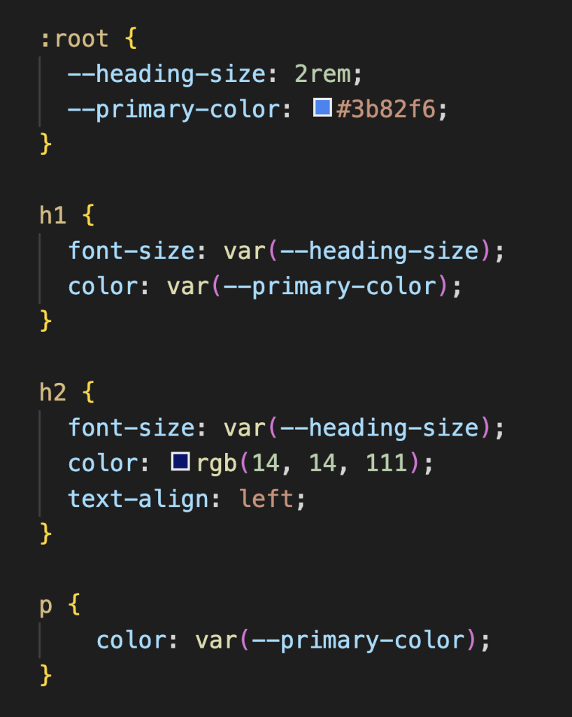
The first step when it comes to CSS Custom Properties is to define your values. In common practice, it is best to define them under the :rootselector at the top of your stylesheet. This allows your custom properties to be accessed globally throughout your CSS. To define a custom property, you use --followed by the name of your variable. Below is an example of how it would appear:
After you’ve defined your custom properties, you can apply them to any CSS property by placing them inside var(). That way, instead of updating the heading size in multiple places, you only need to update it once in the:root selector — any element using that custom property, like h1 or h2, will automatically reflect the change. Custom Properties also allow developers to give their values meaningful, descriptive names, making the code easier to read and maintain.
Key Use Cases
Theming
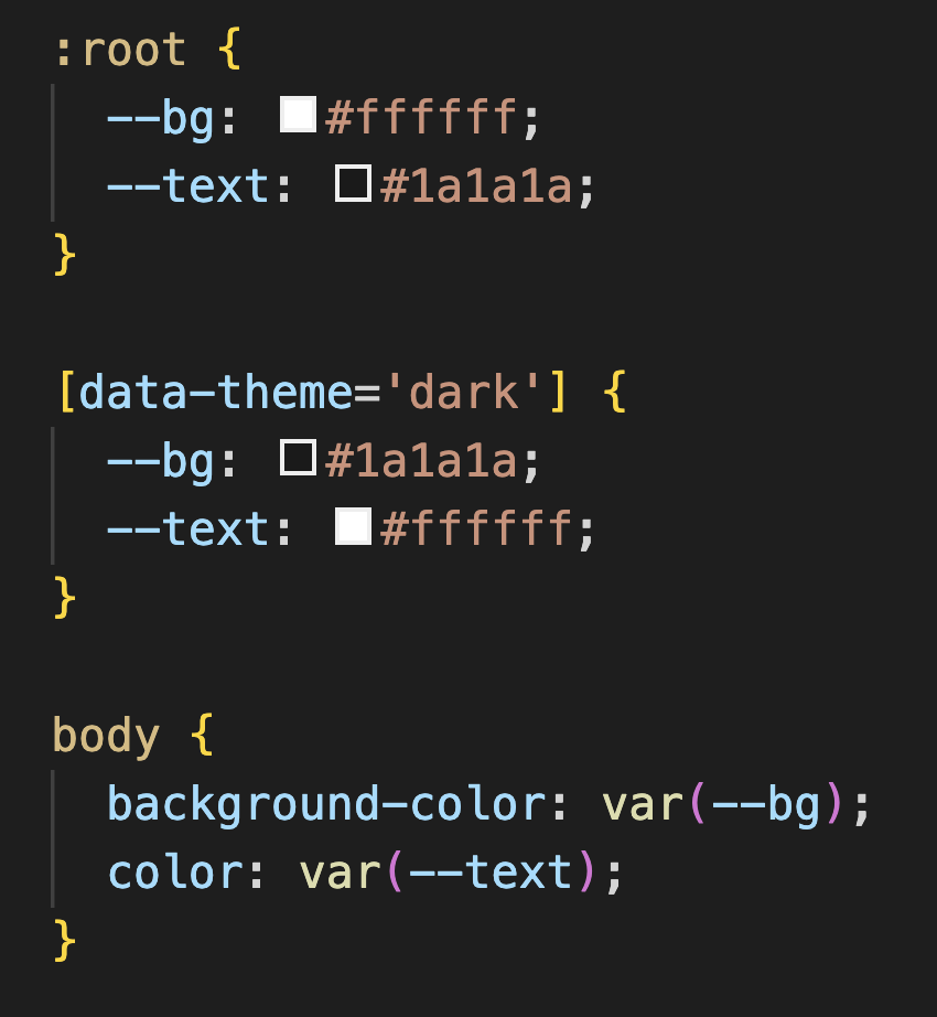
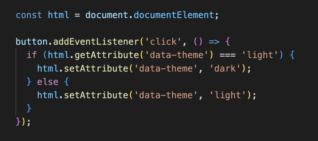
One of the most popular uses of CSS Custom Properties is theming. Before Custom Properties, switching themes meant maintaining an entirely separate stylesheet and loading it in on demand, which was messy and hard to manage. Now, you just define your colours once and override them when needed. You would start by defining your custom properties for your default theme under:root. Then you would redefine those variables under[data-theme=’dark’]. That way all the elements that carry those custom properties will update automatically when the dark theme is active.
To get this working, a small piece of JavaScript toggles the data-theme attribute on your <html> tag between "light" and "dark". When it switches the browser will automatically re-read the custom properties and apply the changes. All the elements will pick up the new values instantly.
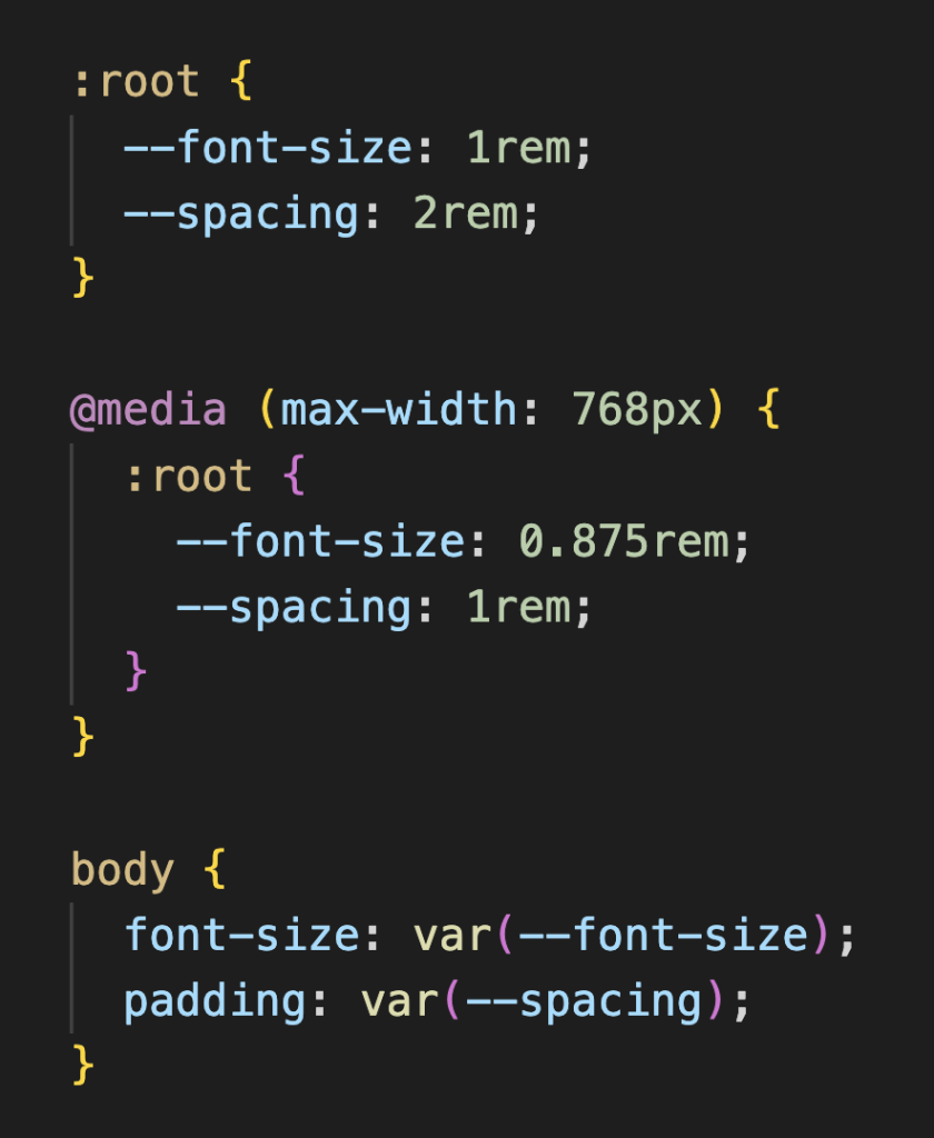
2. Responsive Design
Another great use case for CSS Custom Properties is responsive design. I remember the first responsive design project I worked on and how tedious it was because I didn’t use CSS Custom Properties. Every time I changed a colour or size, I had to manually go through a stylesheet of nearly 900 lines and change every single affected instance. Custom Properties completely eliminate that problem. You just redefine the value once inside a media query and everything updates automatically.
The values defined under:root act as your default screen size. The media query then redefines those same properties with smaller or larger values that suit your site’s needs. Any element using var(--font-size) or var(--spacing) will automatically adjust accordingly, meaning you no longer have to scan through hundreds of lines to make changes.
3. JavaScript Integration
The great thing about CSS Custom Properties is that they can also be connected to your JavaScript. This is actually how the dark and light theme switching would work. You would add a button to your site that the user clicks on. When the user clicks that button it switches thedata-theme attribute on the <html>tag and the browser will update as needed.
This is just one example of how JavaScript and CSS Custom Properties can work together. You can also use JavaScript to update any custom property in real time. Things like changing colours based on a slider, adjusting font sizes based on user preferences, or even driving animations based on mouse movement.
A few things to keep in mind
Use fallback values when defining your variables. That way if a variable isn’t properly set it has something to fall back on color: var(–primary-color, #3b82f6);.
Name your variables clearly. It’s better to be descriptive with your naming conventions, it helps keep your stylesheet functional and understandable.
Define your custom properties at the top under the :root selector if you want the whole stylesheet to access them. Alternatively, you can define them inside a specific selector, but keep in mind that only that element and its children will have access to them.
Wrapping Up!
CSS Custom Properties are a small change but make a big difference to your CSS. They help keep your code cleaner, consistent and easier to update! They are fully supported by all modern web browsers, so you can start using them today!
If you’d like to explore further, here are some resources that helped me understand CSS Custom Properties:
I discovered the Nelphim font in 2020, and I have to say it’s one I genuinely appreciate. It’s a sans serif typeface with an elegant, refined feel that perfectly balances modern simplicity and classical charm. Its clean lines and graceful curves make it ideal for branding, editorials, and headlines that demand attention, bringing a timeless yet fresh touch to any design.
Calibri
Calibri Light has always been one of my favorite fonts to use in emails and professional communication. Its clean, airy design feels polished yet approachable, striking the perfect balance between formality and warmth. I love how it conveys professionalism while maintaining a light, effortless tone of voice that makes messages feel calm and clear.
Roboto
Roboto is truly a go-to font for me when it comes to design. I use it frequently for body text, and it often becomes my default choice because of its clean, highly readable, and versatile style. Its modern, neutral tone makes it easy to pair with other fonts and design elements. That said, maybe it’s time I explore some new font options to mix things up and keep my work feeling fresh.