Initial Version
The initial version of the website was heavily reliant on the visual design and on meeting the project criteria. Overall, it achieved my goal of a functional website, but, as usual, there were areas for improvement. The code was heavily reliant on IDs, misuse of semantics, inconsistent alt-text, non-inclusive, and weak SEO. So I started to slowly dissect the website starting off with the feedback from my professor, David Watson.
Revision
For the website, I began the revision by addressing my professor David Watson’s feedback. There were several points that he made that I needed to address.
- Hard-coded uppercase
- There were several places in my code where I’d written text in uppercase directly in the HTML, mainly on the home page. I switched these out and used
text-transform: uppercasein CSS instead — this way the styling stays in the stylesheet where it belongs and is much easier to change in the future.
- There were several places in my code where I’d written text in uppercase directly in the HTML, mainly on the home page. I switched these out and used
- Markup semantics
- David flagged that I wasn’t always using
<section>correctly and suggested using<figure>when pairing an image with text. I went through my code and found the main issue on the “What’s in Store” page. The products grid had images and captions sitting inside a<div>with plain<p>tags. I replaced these with<figure>and<figcaption>, which is the proper semantic choice for image caption pairings.
- David flagged that I wasn’t always using
- Alt text consistency
- Some of my alt text was describing the image visually, and some was explaining its purpose, which wasn’t consistent. I went back through all the images across the site and tried to keep the approach uniform throughout.
- Navigation hover state
- The hover effect on the navbar was causing nearby elements to shift around, which David flagged as a major distraction. I revised the styles so the hover effect stays contained to the element being hovered over without nudging anything else.
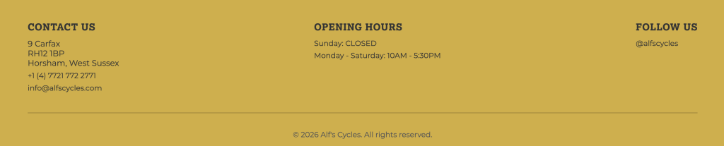
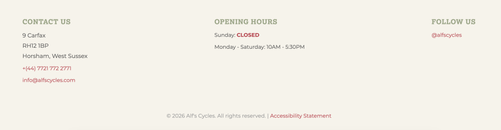
- Footer colour
- David suggested swapping the mustard yellow footer for the green used elsewhere on the site. I did try it, but I wasn’t convinced by it either. I ended up going with a neutral beige instead, which I think sits better with the overall palette. Below you can see the mustard yellow, which was the initial design. With the new design, I was able to have a stronger play on colors as well.
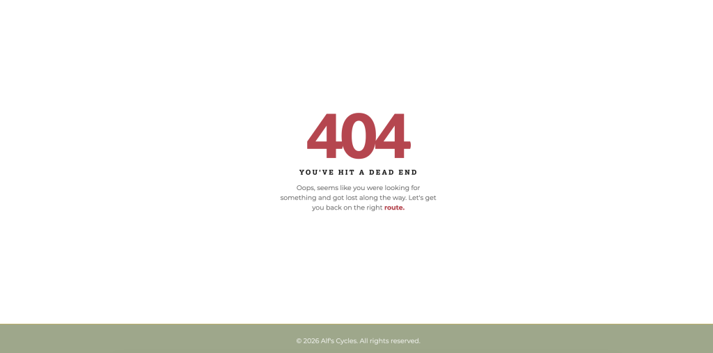
After reviewing David’s feedback, it was time to begin revising the website based on what we learned over the past few months. The first task I started with was the 404 page, which I initially didn’t have.
404 Page
This was done through the .htaccess file. I designed a friendlier page that aligned with the site’s branding. It also returns the user to the main page and enhances their overall experience. Connecting the 404 page to my site was a struggle, but I got there eventually with help from my classmates Sarah & Season.
SEO
- Meta descriptions and titles — each page had a unique, descriptive <title> and <meta name=”description”> tag written with relevant keywords for a local bike shop in Horsham.
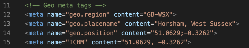
- Geo meta tags — I added geolocation SEO tags to every page with Horsham’s coordinates and region (shoutout to Season’s blog for the guidance on this one!).
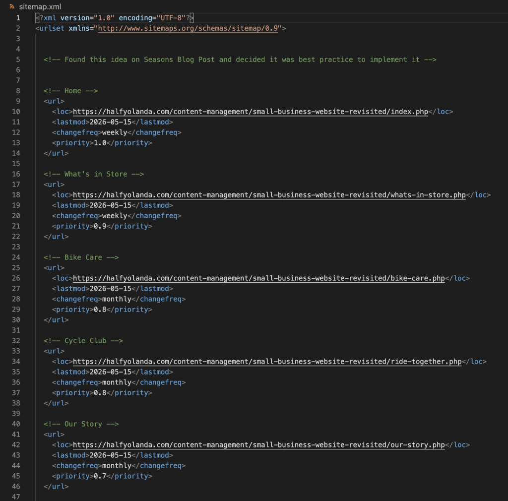
- sitemap.xml — created a sitemap listing all your pages with lastmod, changefreq, and priority values. I wasn’t initially planning to add this, but after going through Season’s journal, I decided it was worth doing properly.
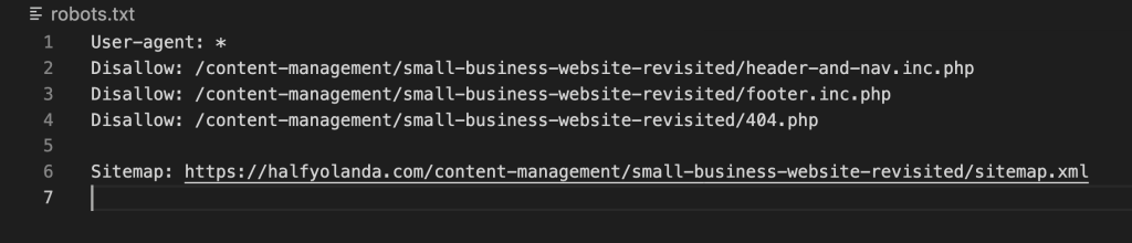
- robots.txt — I added a robots file to guide search engine crawlers on what to index, and pointed it to the sitemap.
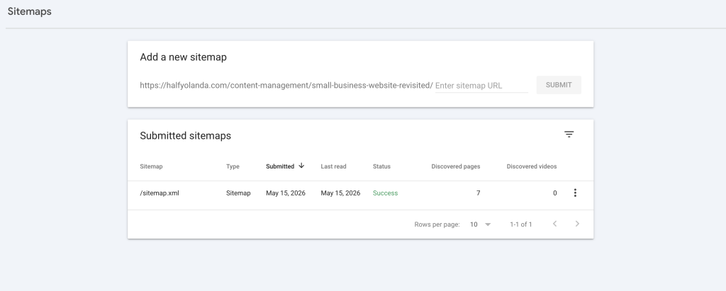
- Google Search Console — I set up Search Console for the site and submitted the sitemap directly so Google can start crawling and indexing the pages.
Accessibility
The next thing I tackled was accessibility. I started by running the site through several tools we’d used in the module, including the WAVE tool and PageSpeed Insights. This gave me a stronger idea of where the website stood before making any changes.
- ARIA Labels – the website initially had none, so I needed to add them to the <nav>, <main>, <footer>, and any other links that were on the site.
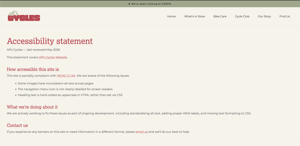
- Accessibility Statement – This page was added and can be found in the footer. It outlines the page’s dedication to an inclusive website and guides users to contact us about any issues.
3. Skip link- I added a skip to main content link for keyboard users and screen readers.
4. It was also suggested that I reduce some of my image sizes. However, after reviewing them, I felt that further compression would compromise image quality. Given that they were already well-optimized and my PageInsights score was at 83, it didn’t feel necessary.
5. One suggestion was to improve the contrast of white text on a green background. After reviewing it, I felt the contrast was sufficient and didn’t negatively impact readability, so I chose not to make changes here.
JavaScript
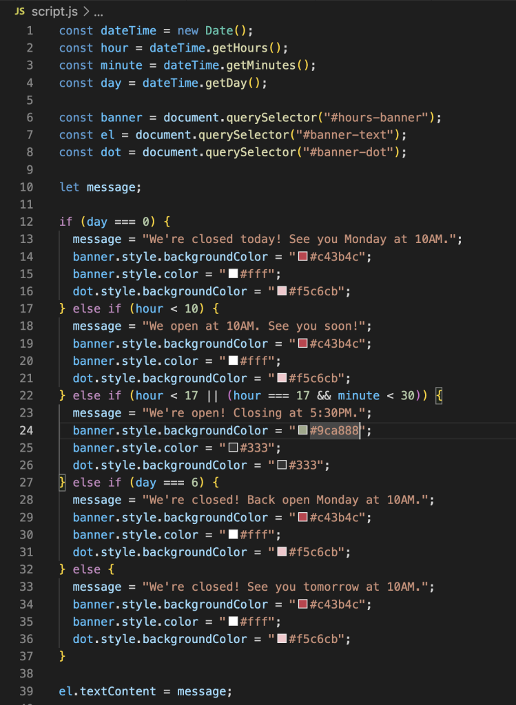
For the JavaScript element, I decided to add a dynamic opening hours banner at the top of the page. Since the site is mobile-first, I felt this was the most practical spot for it. The banner automatically updates based on the current time and day, changing both the text and color to reflect whether the shop is open or closed.
PHP
The last task I tackled was the PHP server-side. For this, I moved the header, navigation bar, and footer into shared include files and converted all my HTML files to PHP. I kept the header and nav together in one file and the footer in another. This made the codebase much easier to manage and maintain, so any future changes to the header or footer only need to be made in one place.